Austin Norris

Principal

UX/UI Specialist

Design, Development, Research

18 Years of Experience

Delivering tailored, data-driven experiences end-to-end, ensuring quantifiable and maximized ROI and efficiency across industries, including automotive, e-commerce, education, fintech, healthcare, hospitality, and more.

Case Studies Process References Contact
BMW Comfort Inn Harland Clarke Holiday Inn Mercedes NASCAR PepsiCo Porsche Under Armour
SpendHQ

SpendHQ

SpendHQ is an AI-powered spend intelligence platform designed to help Fortune 500 companies including Pepsi and Under Armour optimize their spending by integrating supplier and third-party data. Before my involvement, the platform suffered from a dated and inconsistent user experience that frustrated users and limited engagement.

I led a complete UX/UI transformation, implementing scalable systems, redesigning workflows, and delivering a user-focused, modern interface.

~30% Return on Investment

  • Increased Net Promoter Score (NPS) by 133%
  • Boosted product stickiness by 125%
  • Extended average session times by 50%
  • Redesigned over 200 screens
Read Full Study

Challenges

SpendHQ faced several challenges when I joined the team. The platform's design was outdated and fragmented, leading to cognitive overload and inefficiencies for users. The organization lacked user feedback documentation, analytics tools, and research artifacts, making it difficult to identify and address user pain points effectively.

The user base was diverse, ranging from financial analysts to C-suite executives, each requiring tailored solutions to meet their unique needs. Additionally, the absence of established design systems or workflows created inefficiencies in collaboration and development.
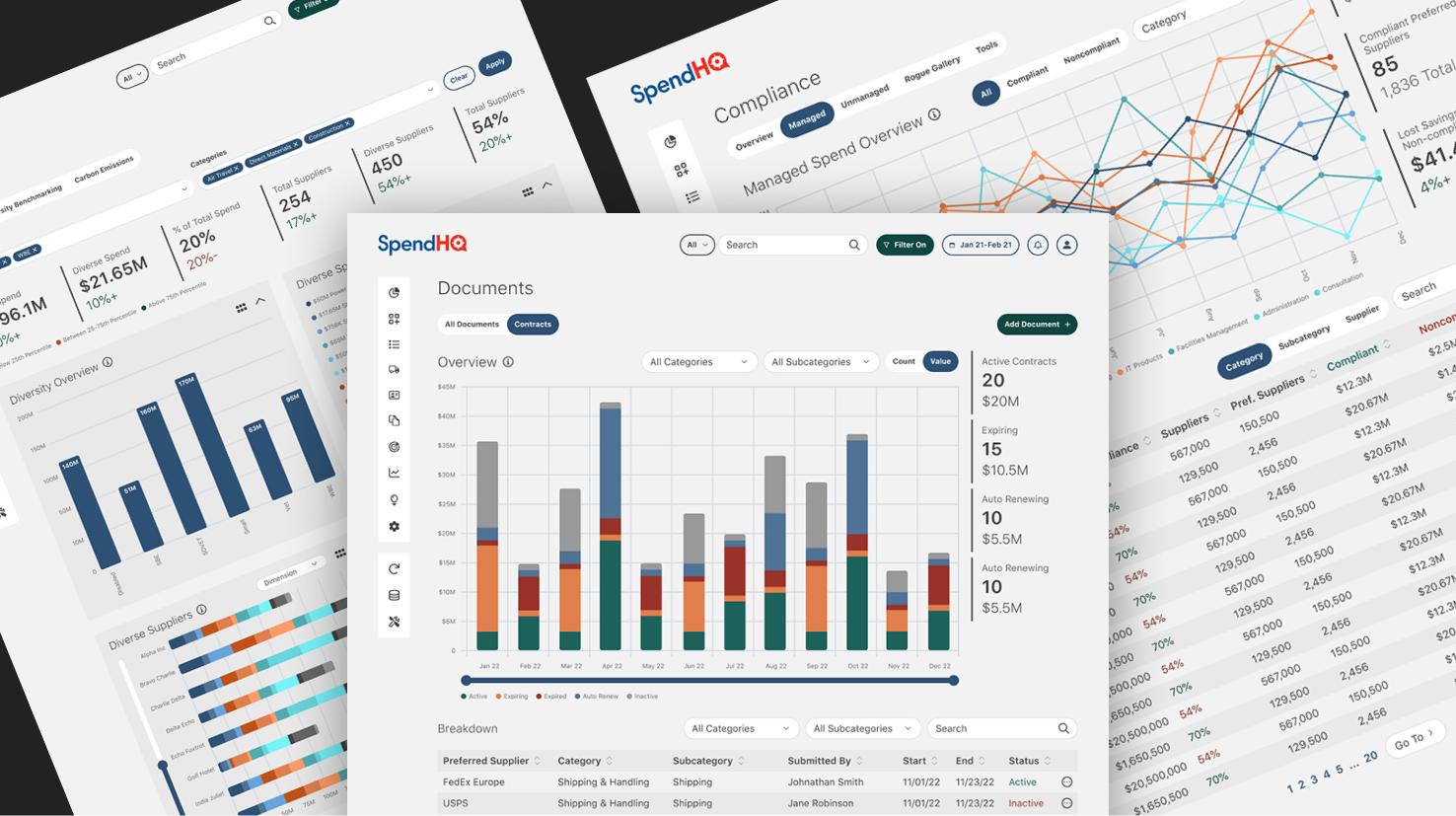
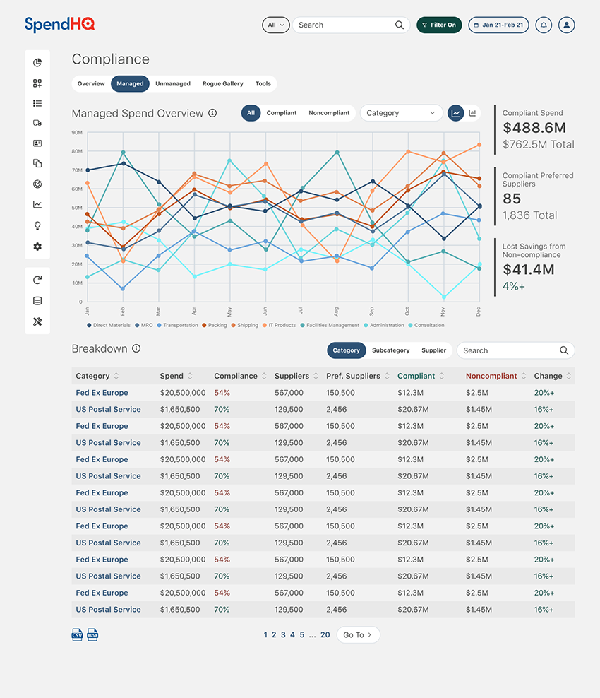
Diversity ScreenCompliance Mock-up

My Approach

To address these challenges, I established a data-driven foundation by implementing tools like Pendo and Hotjar to track user behavior, including NPS scores, retention rates, and heatmaps. These analytics were complemented by competitive research, user interviews, and testing, providing a comprehensive understanding of user needs. I collaborated with the head of product to develop four key user personas, representing users from technical analysts to executives, and mapped detailed user flows using FigJam to align workflows with business objectives.

Building a scalable design system was a critical component of the redesign. I created a comprehensive Figma ecosystem, incorporating atomic design principles to develop reusable components and centralized design files. This system supported both the current app and the redesigned interface, streamlining collaboration and iteration. To foster collaboration across teams, I facilitated workshops with stakeholders, product owners, and developers, aligning priorities and accelerating the iterative design process.

Design System 
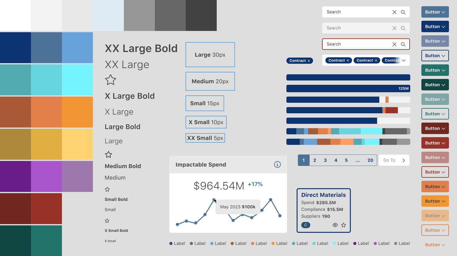
Assets from design system

Solutions

One of the most impactful solutions was the redesign of the "Power Filter," a global filtering tool used to refine data across all screens. I transformed this feature into an accessible, modular header component, replacing the overly complex and disjointed workflow. This redesign was validated through hi-fi prototypes and user testing, resulting in significantly faster task completion rates and higher satisfaction.

I also delivered a cohesive reskin and UX optimization, standardizing UI components across over 100 screens to reduce cognitive overload and ensure consistency. To address user confusion, I designed and integrated a comprehensive help system, including contextual pop-overs and dedicated documentation sections, which improved onboarding and reduced support inquiries. Additionally, I developed interactive prototypes to gather actionable feedback and avoid unnecessary development time, saving hundreds of hours across the project.

Power Filter
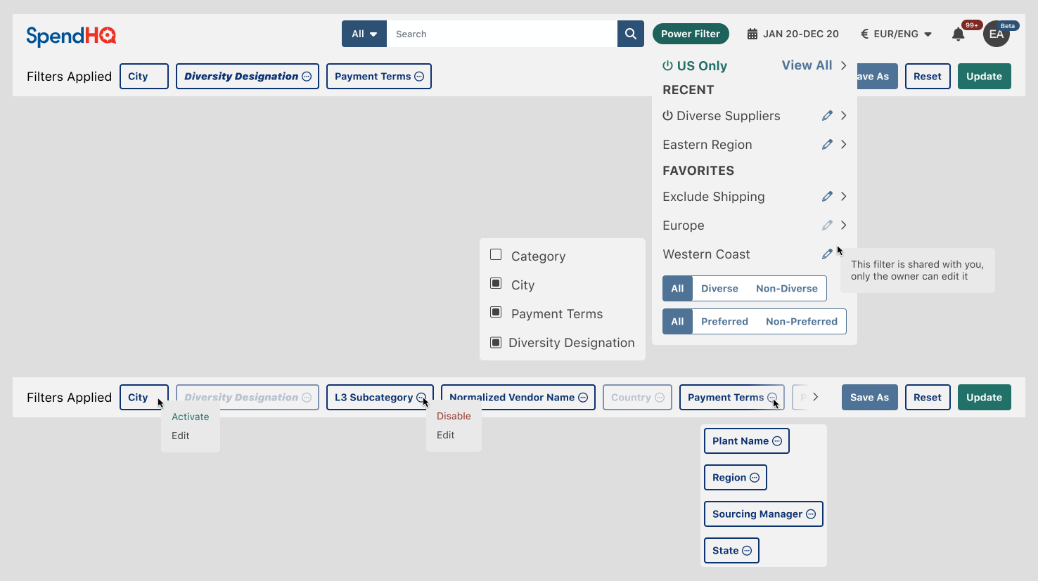
Power Filter controls easily accessible from global header component

Key Takeaways

Leading SpendHQ’s transformation involved establishing scalable design processes, leveraging data-driven insights, and fostering cross-functional collaboration. By prioritizing user needs and aligning them with business goals, I delivered a modern, intuitive platform that significantly improved engagement, satisfaction, and scalability. The project not only enhanced the experience for SpendHQ’s users but also set a strong foundation for ongoing development and innovation.
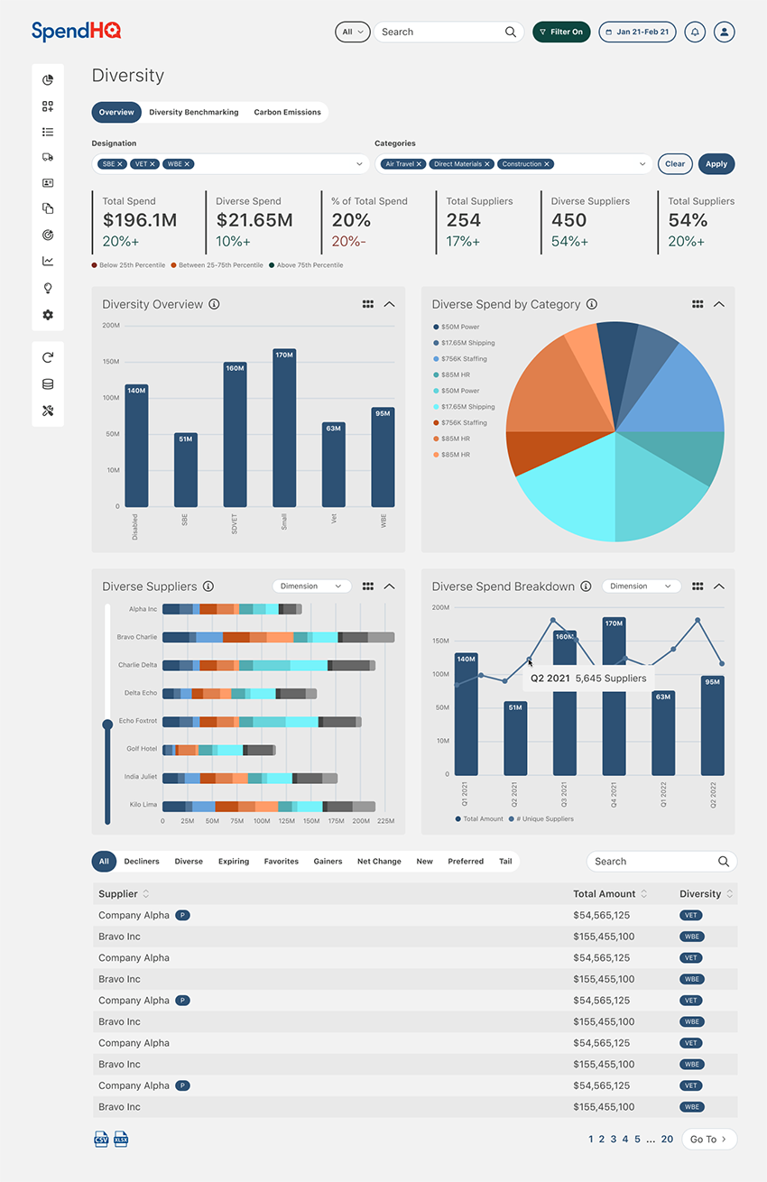
Diversity ScreenDiversity Mock-up
NASCAR

NASCAR

NASCAR, the premier stock-car racing sanctioning body in North America, oversees some of the most iconic racing events in the world. As part of a restructuring effort, NASCAR transitioned from third-party development teams to internal teams for creating and maintaining their digital properties.

My role was to bring expertise in WordPress development and UX/UI design to bridge the gap between designers and developers. I collaborated closely with internal teams to build new websites, enhance existing ones, and ensure seamless functionality during live events, all while adhering to NASCAR’s high-performance standards.

~40% Return on Investment

  • Launched the NASCAR Mexico, ARCA Menards, and Sebring Raceway websites.
  • Enhanced user experience and functionality for NASCAR.com and IMSA.com.
  • Provided live support for digital race experiences, ensuring uninterrupted service during high-traffic events.
  • Bridged design and development gaps by facilitating collaboration between developers, designers, and product teams.
Read Full Study

Challenges

NASCAR’s transition to internal teams created several hurdles. repurposed developers new to PHP and WordPress were tasked with building custom WordPress sites, while graphic designers with limited UX/UI experience were responsible for creating digital experiences.

This mismatch in expertise led to challenges in execution and collaboration. Additionally, the organization required high-performing digital platforms to support real-time race updates, which demanded seamless integration between design and development. NASCAR’s custom WordPress framework added further complexity, requiring precise modifications to themes and plugins to meet both user and business needs.

Sebring HomepageSebring website

My Approach

To address these challenges, I began by participating in creative briefings with product managers and graphic designers to review research findings and project goals. These sessions informed design decisions and ensured that all modifications adhered to industry-standard UX/UI principles, accessibility guidelines, and the execution constraints of NASCAR’s custom WordPress framework. By analyzing site designs, I provided actionable feedback on development feasibility, aligning design intent with technical realities.

During development, I worked independently on projects such as the NASCAR Mexico, ARCA Menards, and Sebring Raceway websites. Each site required custom modifications to NASCAR’s WordPress themes and plugins, which I implemented while maintaining scalability and usability. To ensure efficient progress tracking, I used Atlassian Jira to document updates, manage tasks, and address QA feedback.

In addition to building new websites, I provided enhancements to existing platforms, such as NASCAR.com and IMSA.com, improving user experience and addressing technical issues. I was also responsible for live monitoring and issue resolution during high-traffic race weekends. Working from NASCAR headquarters in Charlotte, NC, I collaborated with live ops teams to resolve real-time issues, such as lap-time reporting errors, ensuring uninterrupted service during critical events.

ARCA Drivers PageARCA Menards Drivers web page

Solutions

One of my primary contributions was delivering three major new websites: NASCAR Mexico, ARCA Menards, and Sebring Raceway. These platforms were built from the ground up, incorporating responsive designs, modern UX/UI principles, and accessibility standards. I also enhanced NASCAR.com and IMSA.com, making UX/UI improvements and resolving technical challenges to ensure optimal performance.

Another key solution was bridging the gap between designers and developers. By providing UX/UI guidance and ensuring compatibility with the custom WordPress framework, I streamlined the collaboration process, enabling efficient execution of projects. Additionally, I played a pivotal role in NASCAR’s live digital operations, quickly addressing technical issues during live races, such as resolving errors in real-time lap-time reporting.

NASCAR Mexico HomepageNASCAR Mexico website

Key Takeaways

My work with NASCAR involved balancing technical expertise with cross-functional collaboration to deliver high-quality digital experiences. By bridging the gap between design and development, I ensured that all projects met NASCAR’s high standards for performance, usability, and accessibility.

The successful launch of three major websites and enhancements to existing platforms demonstrated my ability to adapt to complex technical frameworks and high-pressure environments. Ultimately, my contributions supported NASCAR’s mission to provide engaging digital experiences for fans and stakeholders alike.

SpendHQ

AMSI

Automotive Management Services Inc. (AMSI) manages all digital advertising for its car dealership clients, spanning major brands from Aston Martin to Volvo. The company faced significant challenges in managing and creating website add-ons, display ads, and email campaigns due to the lack of a project management system and frequent issues with compliance, accessibility, and coding errors.

My role was to address these inefficiencies by designing and developing a system that would standardize and automate processes, ensuring consistent quality and compliance while improving task efficiency.

~50% Return on Investment

  • Increased task efficiency by 400%
  • Reduced accessibility, compliance, and coding issues by 90%
Read Full Study

Challenges

AMSI's workflow was a bit chaotic, with no project management system in place to streamline operations. Digital assets, including webpages, email campaigns, and ads, often suffered from errors in coding, accessibility, and responsiveness, leading to potential penalties for OEM compliance violations.

Additionally, long development times and a lack of integration between teams created bottlenecks, impacting the delivery and quality of assets. AMSI needed a centralized system to manage projects, track performance, and ensure compliance across all deliverables.

Porsche Naples Homepage Porsche Naples homepage

My Approach

To tackle these challenges, I began by conducting extensive research into the functions of every role within the agency. This allowed me to identify pain points and gaps in the workflow. Based on these findings, I conceptualized and designed "Phalanx," a comprehensive system to build, track, and optimize digital assets. Phalanx featured drag-and-drop functionality, real-time analytics integration, and error-free, OEM-compliant code generation, addressing AMSI's core inefficiencies.

Collaboration with account executives and OEM compliance teams was critical to understanding the specific requirements and goals of each campaign. For custom projects, I either built assets from scratch or utilized high-performing templates as a foundation. Leveraging data from tools like Google Analytics, Visual Web Optimizer, and Campaigner, I analyzed the performance of assets, identified areas for improvement, and iterated on designs to enhance effectiveness.

One of the most impactful projects was redesigning vehicle search modules for client homepages. By analyzing heat mapping and interaction metrics, we identified two distinct user groups: those with a specific make and model in mind and those with only a general idea. Through A/B testing, we implemented and optimized three variants of the module: dropdowns for year, make, and model; clickable images for body types; and a combination of both. This iterative approach ensured the module catered to diverse user preferences while improving engagement and usability.

 Lexus Special Special for Lexus dealer website

Solutions

Phalanx became the centerpiece of AMSI’s transformation. Designed as a custom WordPress theme with custom plugins, it automated the generation of digital assets such as websites, email campaigns, ads, and landing pages. The system included a UI component library built with HTML, CSS, Sass, JavaScript, and PHP, enabling users to create OEM-compliant, responsive assets quickly and efficiently. Phalanx was responsible for at least 90% of the digital assets produced, with highly custom projects handled manually.

analytics White-boarding the architecture for Phalanx

The system also incorporated job management, staff performance reporting, budget tracking, and client relationship management features, addressing broader operational gaps. User testing with SEO, email, ad, and account management teams ensured that Phalanx aligned with their daily workflows and goals. I conducted usability tests to identify pain points and refine user paths, resulting in a seamless experience for internal teams.

Additionally, I implemented rigorous testing protocols using tools like Litmus and cross-browser testing to eliminate errors in responsiveness and accessibility. Optimized templates were informed by performance data from analytics tools, ensuring assets were both effective and compliant. These changes not only reduced errors but also saved clients from potential penalties related to OEM compliance violations.

analytics Screenshot of Job Management System's Queue

Key Takeaways

My work at AMSI demonstrated the power of combining user-centered design with technical innovation to solve complex organizational challenges. By developing Phalanx, I addressed inefficiencies, ensured compliance, and enhanced task efficiency by 400%. The system transformed AMSI’s digital operations, enabling the team to consistently deliver high-quality, data-driven assets. This case study highlights my ability to identify organizational pain points, design scalable solutions, and lead cross-functional collaboration to drive measurable results.

Phalanx Generated Email Example

analytics Screenshots from analytics tools
Wick

Wick

Wick is a mobile app designed to make the journey of improving well-being a comforting and enjoyable adventure.

Launch Accomplishments

  • Achieved a 100% user approval rating
  • Identified and capitalized on a niche with little to no competition
Read Full Study

Challenges

Learning and applying the science of well-being is often a time-consuming and confusing process. Users must absorb complex subject matter and track multiple goals, which can feel overwhelming and discouraging. Existing solutions lacked engaging methods to teach well-being science while motivating users to take actionable steps.

My Approach

To address these challenges, we conducted a comprehensive SWOT analysis of 25 competing apps in the health and wellness space. This analysis highlighted gaps in gamification and the repetitive interactions that users found disengaging.

To better understand our audience, we conducted phone interviews, collecting both quantitative and qualitative data, such as current app usage, likes and dislikes, and interest in our mission. Using these insights, we created user personas representing adults aged 19–40 at various stages of their well-being journeys.

User Interview Results

User Testing Script

We also conducted card sorting and ideation sessions to determine the app’s core features and user flows.

Card Sorting Card sorting session

Mood-boarding exercises established the app's visual tone, while whiteboarding sessions helped us design workflows and wireframes that catered to all personas. These efforts guided branding decisions, ensuring Wick would feel like a supportive companion on the well-being journey, incorporating nature-inspired aesthetics and a comforting fire motif into its logo and design system.

Style Guide

Moodboard Mood-board example Whiteboarding White-boarding screens Whiteboarding journey White-boarding the user journey

Solutions

Our design process started with wireframes based on whiteboard designs, followed by the development of a lo-fi prototype to test the app's core features.

Lo-fi Screenshot Lo-fi Screenshot

User feedback revealed valuable insights, including pain points and opportunities for improvement, which were addressed in the hi-fi prototype. The hi-fi design incorporated all user states identified during testing and brought the app’s visual language to life. The app’s journey-based format, combined with gamified tasks, resonated strongly with users during testing.

Wick's gamified structure rewarded users for completing tasks, with rewards weighted based on task difficulty to encourage progression. Points, badges, and other elements fostered a sense of achievement while breaking down complex well-being science into manageable steps. The app’s empathetic tone and adventure-inspired visual language created a welcoming and motivating user experience.

Prototype Hi-fi prototype

Key Takeaways

Wick successfully transformed the complex science of well-being into a digestible, gamified experience that users loved. By combining user-centric design with gamification and empathetic communication, the app stands out in the crowded wellness space. With a 100% approval rating, Wick proved to be an engaging, supportive tool for improving well-being, setting a high standard for innovative, user-centered solutions in the industry.

Adobe XD Prototype

Process

Research01

Understanding the problem is where it all starts. Analyzing and defining users and their needs lays the foundation. The insights uncovered inform ideation and shape the product's final design.

FigJam Jira Notion SWOT Card Sorting Competitor Analysis Stakeholder Interviews Surveys User Interviews Analytics Analysis User Personas

Design02

Low-fidelity prototypes are created and iteratively tested with users to identify pain points and improve workflows. Once validated, high-fidelity designs are developed, incorporating branding, accessibility, and visual consistency.

Adobe Illustrator Adobe Photoshop Adobe XD Figjam Figma Branding Design Systems High Fidelity Low Fidelity Prototyping User Flows User Stories Wire-Framing

Develop03

I develop complete digital products or UI prototypes for handoff to other developers. I adapt to existing platforms or select a new platform to build a product on. I leverage separate environments and version control systems to keep everything organized and functional.

CSS Ghost Handlebars HTML Git Github Gulp Javascript jQuery Liquid PHP SASS Shopify Twig WordPress CMS Themes Plug-ins UI Prototypes Websites

Test04

Interactive prototypes are tested for usability, and feedback is implemented before handoff to developers, or I begin development myself. I work with QA to resolve any final bugs before launch, or if I'm acting as QA, I leverage Litmus to conduct rigorous testing across devices and applications.

Post-launch, I return to analytics and user feedback, guiding continuous optimization to ensure the design evolves with user needs.

Google Analytics Hot Jar Litmus Pendo UserTesting.com A/B Testing Analytics Analysis QA User Testing

References

Contact Me

Learn more about my 18 years of experience, including certifications, volunteer work, and a complete list of all my projects, or drop me a line so we can get started on making your digital dream a reality.